A Publishing and People Platform
Back in 2004, there was no unified online Hawaii MLS, so we made one. But this is 2017 and search is ubiquitous; there are 1000 search engines and way too many tools. So, we set out to create a platform that is more than just another catalog. We have an opportunity to express Hawaii Life’s personality, people and local knowledge. Our website is for sharing the wonder (and challenges) of living in Hawaii. HawaiiLife.com is an expression of the special flavor that makes Hawai‘i Life, Hawai‘i Life.
Open and Simple
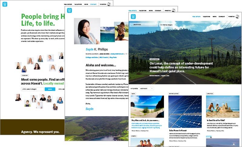
Hawaii is naturally interesting and visual, so we let that beauty come forward. The design is intentionally simple and open. Big type and imagery. Lots of space. Less noise so you can focus on the content. We also eliminated a lot of stuff.
No More Value Score!
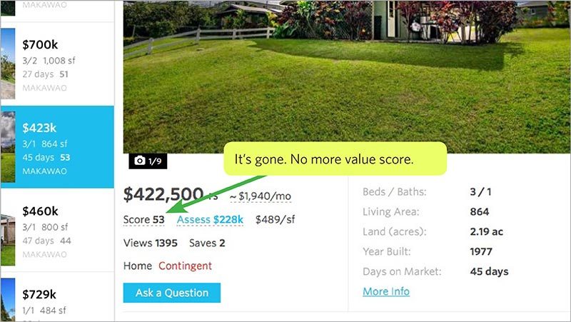
The previous version of HawaiiLife.com used various data parameters to calculate a “value score” that was intended to give the user an assessment of the value. It didn’t always work and created some friction among our sellers and agents. We’re going to let people assess their own value. How long has a property been on the market? How valuable is it for you to be close to the beach, in a resort, or on large acreage? Value is subjective. Work with your agent to determine what value means to you.
Big Images (Because We Gotta Have More Cowbell)
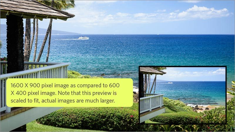
Unfortunately, most MLS providers still output images at 600 X 400 pixels in their data feed. You don’t have to know what those pixels mean other than they are tiny, degraded images by today’s standards. The new HawaiiLife.com augments MLS data with significantly larger, wide-screen images at 1600 X 900 pixels. We also use high-res images in our blog and many other areas of the site.
Hawaii Life People. Here to Represent, Create and Support.

Hawai‘i Life is such a great team. Each day, around Hawaii, some very talented people show up to work and represent The new site is built to acknowledge and express the agents, creatives, support staff, administration and leadership that have entrusted their careers with our 100% locally owned and created company.
A Phone Number. Customer Experience Staff.
Believe it or not, you could not find a phone number on the previous HawaiiLife.com. That’s was a shame because we have an excellent customer experience staff that can help with all kinds of requests. Local knowledge. Connecting with the right agent. What’s the weather like? We believe that these kind of questions and needs are best answered by a real person.
Change is Good. Evolution is Good.
We are just getting started. These are just a few of the things we’ve built into our new web platform. Hawai‘i Life is young and nimble. It’s fun to see things progress over the coming months, and years. Some stuff will be great, other things may flop. But that’s the whole point. The joy is in the creative and exploration that comes with a dynamic project like HawaiiLife. com. We’re gonna keep listening, testing, trying things out and coming up with new ideas.
Stephanie Fick
April 13, 2017
I don’t think the new website is nearly as easy to use. I am discouraged about using it for shopping. Historically, I have been on the site at least once a week, but I don’t see myself using it now.
Winston Welborn
April 13, 2017
Aloha Stephanie, thanks for the feedback. We are working on a number of improvements including speed, split views, and other elements that were in the previous version. Please feel free to submit specific suggestions. Thanks.
Liz Thompson
April 13, 2017
Hate that I can’t search by status – part of my daily routine was to look for new listings and see what had gone under contract. While I am not planning to sell my home or purchase other property at present, I am just completing an extensive remodel and enjoyed being able to get a quick easy glance at what the market was doing….Can’t do that on your site any more…
Winston Welborn
April 13, 2017
Hi Liz – we are bringing back the status filter soon, along with a number of other improvements and options.
Ethan Benson
April 13, 2017
First the good: I think the new design looks fantastic. The map function is much faster and more stable then it was before. It is also nice that the zoom level on the map isn’t reset every time you click a listing.
Now the suggestions for improvement. I too find the removal of the status filter to be a problem. Particularly since Pending/Contingent properties are being included by default, in many areas this just creates far too many results. In my opinion most consumers are not going to want to see properties already under contract. For someone who is checking the site on a regular basis (daily or weekly) having the ability to filter out all but the newest listings is a great time saver by eliminating everything that has already been seen.
The next issue is the ‘Price’ drop-down menu does not seem to function, though you can still filter it through the ‘Options’ menu.
In the map view the small listing popup is perhaps a little too spartan on detail, I think it should include status, bathrooms, and perhaps lot size. I have mixed feelings about opening a new tab/window when clicking the listing for full detail as opposed to full-size overlay window that can be dismissed without disrupting the search or map zoom. I tend to think an overlay window would be a little more user friendly as a buildup of tabs might be confusing for some users. The only real advantage I see to opening the full listing in a tab would be to allow for it to be bookmarked, but that isn’t really needed since the site allows for signed in users to mark them as favorites already.
I also miss the combined list view with the map. I found it useful to be able to hover over the listing and see it’s location highlighted. This is probably more subjective, but I personally find straight downward lists easier to deal with then grid views. I don’t see why all three view methods couldn’t co-exist as separate view options.
There are a few visual glitches I have noticed, in the blog/articles section I would suggest giving each article a fixed size box, this will ensure the grid is aligned nicely. Currently the articles are not aligning in a clean grid. Also the sort order is strange, it seems to descend by date going downwards in the first column and then continues in the middle and then third. I think sorting by date left to right would be more logical. Again subjective but I personally would prefer a straight list, one article per row. Another silly nit, the Hilo office map location is showing it near Kailua, Oahu!
Overall, good work, I do think adding back the status filter would alleviate some complaints.
Winston Welborn
April 13, 2017
Thanks for the feedback Ethan, it really helps us improve. We’re already planning on releasing many of the features you mentioned – status filter, price drop down consistent with how it is in options, more info on the map popup, split view with map and list, filters for the blog.
Opening the listing in a new tab is something we wanted to try, but if the feedback is not good we’ll look to other solutions.
The variable height of blog previews solves some design issues. By intentionally breaking a super tight grid we are able to have images of various heights and, more importantly, it allows us to let headlines be as long or short as they want to be. Currently it’s not implemented correctly because when you hit the “load more” button it starts with a new top-aligned row, which is not how I designed it. As with other things, we’ll watch this and solve with design.
Mahalo for checking things out.
Ethan Benson
April 13, 2017
> Mahalo for the followup. Glad to hear some of the UI features are coming back. Look forward to seeing it.
Regarding the blog, I get it (I am a web developer in addition to a Real Estate broker…), this is a really tough problem to solve in web design. The OCD part of me is tickled quite a bit by the mis-alignments. It would help if each row would align at the top, but that is harder then it sounds.
Is there a good contact to send feedback/bug reports to? Feel free to PM my email.
Mahalo for listening.
Bruce Klein
April 16, 2017
What I’ve always found missing from sites like this is the data on what the transaction finally closed at. As a buyer or seller, what I ultimately care about for comps are the final prices as reflected in the completed transaction, not the listing prices which could be anything. I realize that at the time the closing price is posted the listing is gone, but there must be some good way to expose historical data (including everything that was present in the listing, i.e. photos) with the final result. Any ideas?
Winston Welborn
April 17, 2017
Hi Bruce, we definitely are going to add sold data to the search experience. A user could select one (or multiple) status attributes and display that in the results. Sold properties will be displayed and you can select how far back in time you want to go. Thanks for the feedback.
Scott Conrad
April 19, 2017
I think the new layout is great. I would suggest looking at an alternative set of map tiles. There are scrollbars on windows chrome in a lot of places.
As for sold data, I remember on HIS that you have all of the data going back to like the 90s or 80s. You also have every price change or change in status, which could be useful, and there was a decent amount of effort spent in keeping this data. As places come off and on the market, you are still to this day collecting that data.
Another thing Winston that I am looking to bring somewhere, is the ability to do an AND search. For example:
Show me houses that are in Princeville, that have 3 bedrooms, and are between 900k and 1.3m. AND show me land only in Haena, AND show me new condos build after 2002 in Poipu that are between 600-950k. Give me alerts based off of this, not 3 different alerts and my remembering to looking at 3 different searches. I haven’t really found anywhere that allowed for this, a lot of code really isn’t set up for this kind of search.. but it is pretty easy to do.
As for opening in a new tab, I think going with the overlay is the way to go. If clicking on a map, I would pick the left half of the map, pan the map so that point is the center of the “left half”, open an overlay on the “right half” showing details.
Winston Welborn
April 19, 2017
Thanks for posting Scott and for your suggestions. We’ll check out the map tiling issue.
We definitely want to include sold data, however there are restrictions on what data we can display. We’re gonna look into it.
Your AND search idea is a good one. From a UI perspective the user could set up multiple saved searches and there could be a “merge saved searches” function.
We’ll see how tabs pan out. Airbnb has been doing it for a while now. The concept here was essentially being able to “save” properties without having an account. We also want to bring back split view in search.
Mahalo and take care.
Kicka Witte
April 19, 2017
I am sad to say I miss the old site. I love evolution, but only if it’s for the better. The new site is difficult to navigate, and misses some of the old functions I felt made Hawaiilife my first choice in looking for properties, and recommending properties to others. There are so many kinks, many listings don’t show up with pictures etc. It might look better, but It’s simply not a joy to navigate anymore.
Winston Welborn
April 19, 2017
Give it time Kicka. We’re listening and implementing features and fixing issues every day. Websites are a dynamic, ongoing process and are never truly done. We expected that users will miss some features and we’re always listening to feedback. The listing images were an issue with the MLS feed. Hawaii Life needed a new platform that allows us to express more than just search. Mahalo for your feedback.
Kicka Witte
April 21, 2017
Will do. Really miss being able to search by land size, also miss being able to see listings on the left while seeing the map. I liked the “score” feature also… I am sure the kinks will eventually be worked out, but it doesn’t change that it’s difficult to navigate. >
Winston Welborn
April 21, 2017
Land size, split view and other features will be coming back. The score will not return. Not sure what you mean about navigation. Mahalo.
Kicka Witte
April 21, 2017
Glad to hear! By navigation I mean the ease of cruising a website. The old website was super clear and simple. The new version has so many kinks (like me choosing North Shore properties and Kalaheo properties show up), or that flashing of the big main page picture as I go between searches, or simple things like wanting to search a location with priority of land size not working. That is what I meant. It’s not as easy to find what I am looking for. I am sure you will update in time. >
Winston Welborn
April 21, 2017
Hi again Kicka. The map centering on towns correctly is a mapping thing that we are going through and fixing for various locations. We just need to dial in the level of zoom. We are adding land size to the filters and options. Not sure what you mean buy the big image flashing, but we are removing the image below the search. Yes, it will get better and better. This is a rebuilding process. Thanks.
Kicka Witte
April 21, 2017
> Navigation = ease of use.
Marcel
May 2, 2017
Aloha! I like that you are working at updating the website. There were a few glitches with the old that hopefully will be corrected with the new site.
One old problem that has been fixed already is the zoom buttons being moved from the right side of the screen to the left. They used to be under the “ask a question” where they were inaccessible -it is much better now!
One thing I do miss is the ability to choose the option of leasehold or freehold. I understand that I can type it into the search field but it is much easier (for me at least) to click it as an option.
Another problem with the old site (and it may be the listing realtors and not the HL site itself, but the Maui listings for condos rarely had information regarding maintenance fees/ lease rent (if applicable) & lease expiry date (if applicable) under the old “More info” button. Hopefully it becomes mandatory to have that information included in the future.
One other feature I found useful was the link to the County Website. It gave useful tax information -whether there are any outstanding taxes, when any permits were pulled and for what reason, etc.
Keep up the good work! I look forward to the changes coming in the future. May this site become as beautiful as the islands themselves!
Winston Welborn
May 5, 2017
Thank you for these comments Marcel. We are adding property status and tenure to the filters. Also adding back in condo data, but yes it is often a function of what the listing agent inputs into the MLS. The County data link will be live again next week.
Not sure about the mortgage calculator. I works for me. Mahalo.
Marcel
May 2, 2017
One other thing I failed to mention was that the mortgage calculator isn’t working.