Activities Explore Hawaii Like a Local best local spots across O’ahu Kyle Malmay | Oʻahu Local Guide & Real Estate Resource This map is a collection … Kyle Malmay June 8, 2026
Oahu New Listing in Mililani – The Ridge at Launani Valley! Discover your new home in Mililani! Nestled in the highly sought-after Ridge at Launani Valley, this charming, 3-bedroom, 2-bathroom townhome … Hawaii Life April 15, 2024
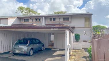
For Sale Central Location In The Peaceful Town of Mililani This is what you have been waiting for… A Great Buy! 95-2051 Waikalani Place #E3022 is a 2-bedroom-one-bath unit with … Diana Novoselic Ricciuti November 7, 2022
Oahu New Listing: Cute, Homey and Completely Upgraded Townhome in Mililani You will be instantly WOWED by this cute, homey, and completely updated townhome in Lanikuhana Patio Homes in Mililani (MLS … Cathy Possedi, R(B) September 21, 2022
Oahu Space and Place: Living in Mililani with Room to Grow There’s a lot to enjoy about this spacious townhome — from the open living and dining areas to the floorplan … Hawaii Life March 5, 2021
Oahu The Best of Independent Living: Studio at Olaloa in Mililani Mauka 95-1050 Makaikai Street #23C Rarely available: a desirable studio in Olaloa, an independent living, and gated community in Mililani for … Cathy Possedi, R(B) August 7, 2020
Oahu Nanea: Tranquil Life at Koa Ridge Koa Ridge’s very first neighborhood is finally here! Nanea Phase I and II single-family homes are now available and here’s … Hawaii Life July 20, 2020
Selling Advice 3D Virtual Showings | “New Normal” in Real Estate The future is here. Virtual real estate showings are the “new normal” in real estate. Sellers who are not virtually showing … Hawaii Life March 26, 2020
Military No Limit To The VA Loan In 2020! There’s no limit to your purchasing power in 2020! Hawaii is home to many active and retired service members. If … Leane Darling Horton January 13, 2020
Military Military Home Buying On Oahu When military service members PCS to Oahu, Hawaii, they have an opportunity to utilize their VA loan benefit and Basic … Monica Princhetta December 6, 2019
For Sale Just Listed: Brand New Construction In Mililani, Oahu Brand New Construction Built In 2019 Be the first to live in this beautiful new home nestled between ironwood and … Hawaii Life November 27, 2019
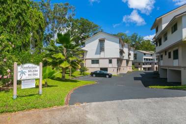
Condos Kuahelani Apartments in the All-American City of Mililani The Kuahelani Apartments sit on the 72-par Mililani Golf Course in Mililani Town. Here’s a little bit of history. Mililani … Hawaii Life July 29, 2019